

This is a continuation of the previous post on Jupyter notebooks and Matplotlib. In this post we will continue to use our AWS Notebook Instance to:
- Load data from our data lake (S3 bucket) to produce the same line graph
- Transform the line graph from step 1 to a bar graph
To get started, upload the file “chocolatebars.csv”, which is available in the Github repository here, to our pseudo data lake (i.e. your S3 bucket). All the files for this tutorial can be obtained from the Github repo here.
In the AWS console, open the Amazon Sagemarker services page and start your notebook instance. Then click on the ‘Open Jupyter’ button.
Create a new notebook using the conda_python3 kernel and label it appropriately. We will need a few additional tools loaded into this notebook such as the Matplotlib, Numpy and Pandas libraries. To do this, enter the following code into the first code cell and run the code to import the required libraries:
from matplotlib import pyplot as plt
import numpy as np
import pandas as pd
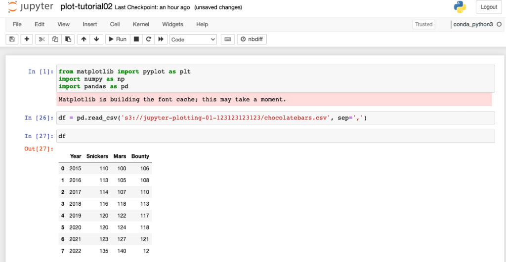
We will load our data using the Pandas library by directly importing data into a Pandas dataframe using the code below. In my example below, my S3 bucket is named ‘jupyter-plotting-01-123123123123’ and the data file name to import is chocolatebars.csv)
df = pd.read_csv('s3://jupyter-plotting-01-123123123123/chocolatebars.csv', sep=',')
To display the data in the dataframe and confirm the data type, run the following command:
print(type)df)
df
If you are new to dataframes, here are some useful commands in Pandas to get you more familiar with this new object type:
df.columns – shows column headings in the dataframe
df.index – shows index summary (normally range data)
df.iloc[[0,3]] - returns data from lines 0 & 3 of the dataframe
df[:3] – shows first three lines of dataframe
df.loc[[0,3,7],["year", "snickers"]] – shows data from indexes 0,3 & 7 for columns year and snickers.
data_snickers = df['snickers'] – assign data in column snickers to a new object called data_snickers

Lets extract our data and create the basic line graph (ignore the fact that some variable names below are prefixed with ‘bar’, we get into the bar graph shortly).
bar_year = df['year']
bar_snickers = df['snickers']
bar_mars = df['mars']
bar_bounty = df['bounty']
Create the line graph by running the code in the cell below, hopefully the graph will look familiar.
plt.plot(bar_year, bar_snickers, label='Snickers')
plt.plot(bar_year, bar_mars, label='Mars')
plt.plot(bar_year, bar_bounty, label='Bounty')
plt.title('Chocolate bar manufacturing cost ')
plt.xlabel('Year')
plt.ylabel('Manufacturing cost / cents')
plt.legend()
plt.show()

We can change the keyword ‘plt.plot’ to ‘plt.bar’ (lines 1-3) in the previous code cell to produce the bar graph below.

Unfortunately the above plot is not very useful as we have lost some data due to the plt object layering on top of itself. We will need to set a bar graph width and offset the bars so all the data is visible. To update the graph so the bars are visible we need to:
- Create a new x axis data object using numpy via ‘x_indexes = np.arange(len(bar_year))‘
- Set the width of each bar graph by adding keyword ‘width’ into the plot definition ‘width=bar_offset‘
- Offset the bar graph for each series by subtracting/adding the bar width to the x axis data value ie ‘x_indexes – bar_offset‘ for snicker series
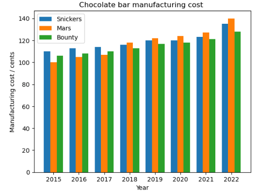
- Set the x-axis tick label (2015 – 2022) via the xticks command so that the x-axis ticks are the same as the original indexes values via plt.xticks(ticks=x_indexes, labels=bar_year). The updated code cell is shown below,
bar_offset = 0.25
x_indexes = np.arange(len(bar_year))
plt.bar(x_indexes - bar_offset, bar_snickers, width=bar_offset, label='Snickers')
plt.bar(x_indexes, bar_mars, width=bar_offset,label='Mars')
plt.bar(x_indexes + bar_offset, bar_bounty, width=bar_offset, label='Bounty')
plt.title('Chocolate bar manufacturing cost ')
plt.xlabel('Year')
plt.ylabel('Manufacturing cost / cents')
plt.xticks(ticks=x_indexes, labels=bar_year)
plt.legend()
plt.show()
Your plot should look like the bar graph below when you execute the code cell above.
Hopefully you have gained some additional insights into:
- Using the xticks variable to label the x axis values
- Creating a bar graph by setting the bar widths and offsetting the indexes values to make all series visible.
The Github repository also contains a Jupyter notebook with the tutorial commands and a graph output by running the plt.savefig() command.
